
Context
THE PROBLEM —
Bad choices had cost the company a lot. As the old version of the app was built by another company, the lack of proper visual and experience design allied to several bad tech stack choices had made the app almost impossible to use. With a low adoption rate, several bugs, and instability the app had its entire user base depleted and the project was paused.
A year later, as the market kept pressing the company towards a solution for accessing guidelines on how to apply the company's products safely in the field, the directors board decided to bring in a new task force to the app. This time focusing on its structure and core features, aimed to a wide range of users from different backgrounds and study levels.
KEY PAIN POINTS —
- 01Bugs and instability
- 02Complex business rules
- 03Terrible navigation structure
- 04Inconsistent visuals
Design
Challenge
How can we create an effective digital experience that enables a wide range of users from different backgrounds to safely apply crop protection products in the field, while still providing room for even more useful features in the future?
The
Process
Working as tech consultancy partners, we at ioasys came up with a plan for the project divided into four stages, starting with an immersion on the company's context with a series of field trips, and a strategic period when we defined the tools, frameworks that would be used. Then we moved to a longer period, where our force task effectively designed, developed and tested the app's new MVP for its new release a few months later and finally started working on a series of agile sprints for minor refinements, improvements and new features.
My Role
PHASE 1: IMMERSION —
We started out with a series of field trips to soy and wheat farms in Brazil, looking to understand how chemical protection products are applied in the crops, the challenges associated with this process and how people learned to do it. Later we set a discussion time, where the team and stakeholders set together to define the personas for the projects, the core features to be developed and how this would be evolved later.
PHASE 2: STRATEGY —
Following the feature definitions, the design team started mapping and prioritizing each of the current app user flows, mapping out the severe navigational problems and bad design decisions. Meanwhile, the development team used this time to analyze the app's current architecture and software stacks, defining which tools and frameworks would be used and what would be the best strategy to bring the app back online, which ended up being to rebuild the app from scratch with React and NodeJS.
PHASE 3: RESTRUCTURE —
Working in intense collaboration with the company's technical team, we ran a series of small collaboration workshops. Using affinity diagrams to correlate the company's products to the pests they were used to fight against and translating these into an information architecture that guided the design for the app's main feature, the product catalog.
Moving on, we set off a new navigation structure to the app and started redesigning the mapped user flows, introducing visual refinements, fixing inconsistencies and creating a new style standard to the app, creating a new set of icons and photos. Finally, we went back to the field to run a series of usability tests, and discover a few extra improvements we could do on our interface to enhance even further the user experience prior to the new release.
PHASE 4: NEW FEATURES —
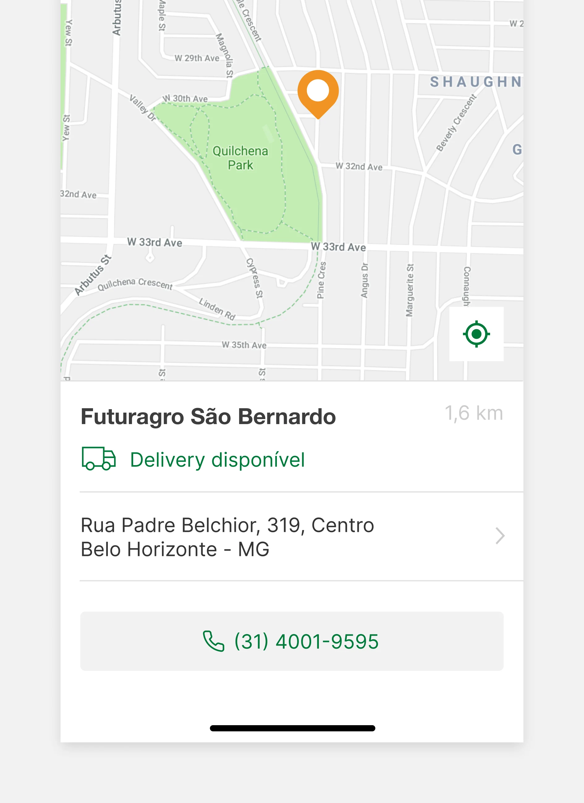
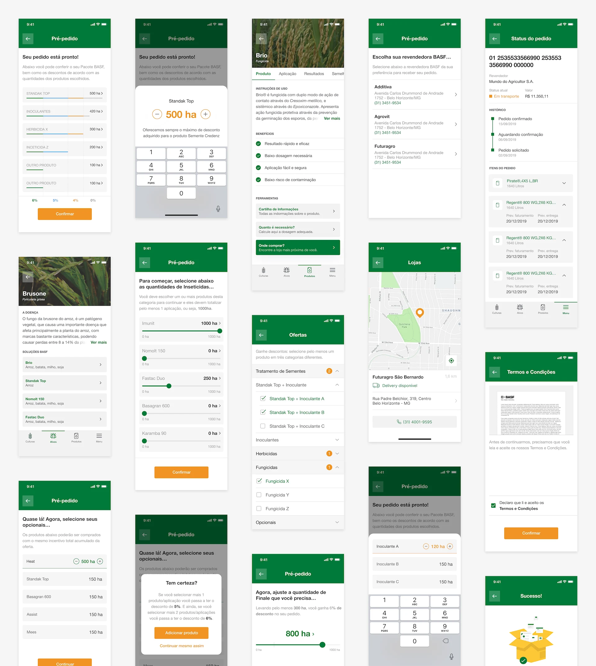
Having gone through the app's main features through a few months and having released the app's new version, we started running a series of agile sprints, working on a few app improvements and bug-fixes to a series of new long desired features, like finding stores, calculating the right amount of product for each farm, and lastly having the ability to order and track products directly trough the app.
Solution
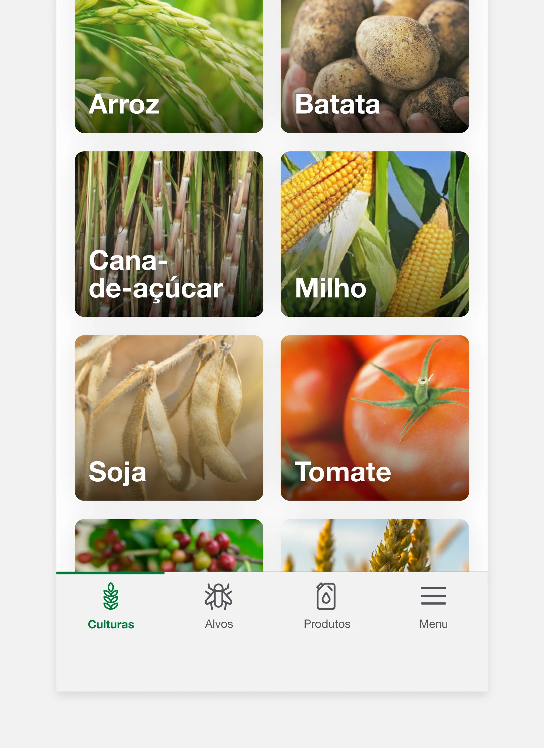
RESTRUCTURE AND VISUAL POLISHMENTS
Looking forward to solve the app's main navigational problems, and outdated visuals, we designed a new navigation bar, bringing together some much needed new visuals, icons and photography the app's user interface.
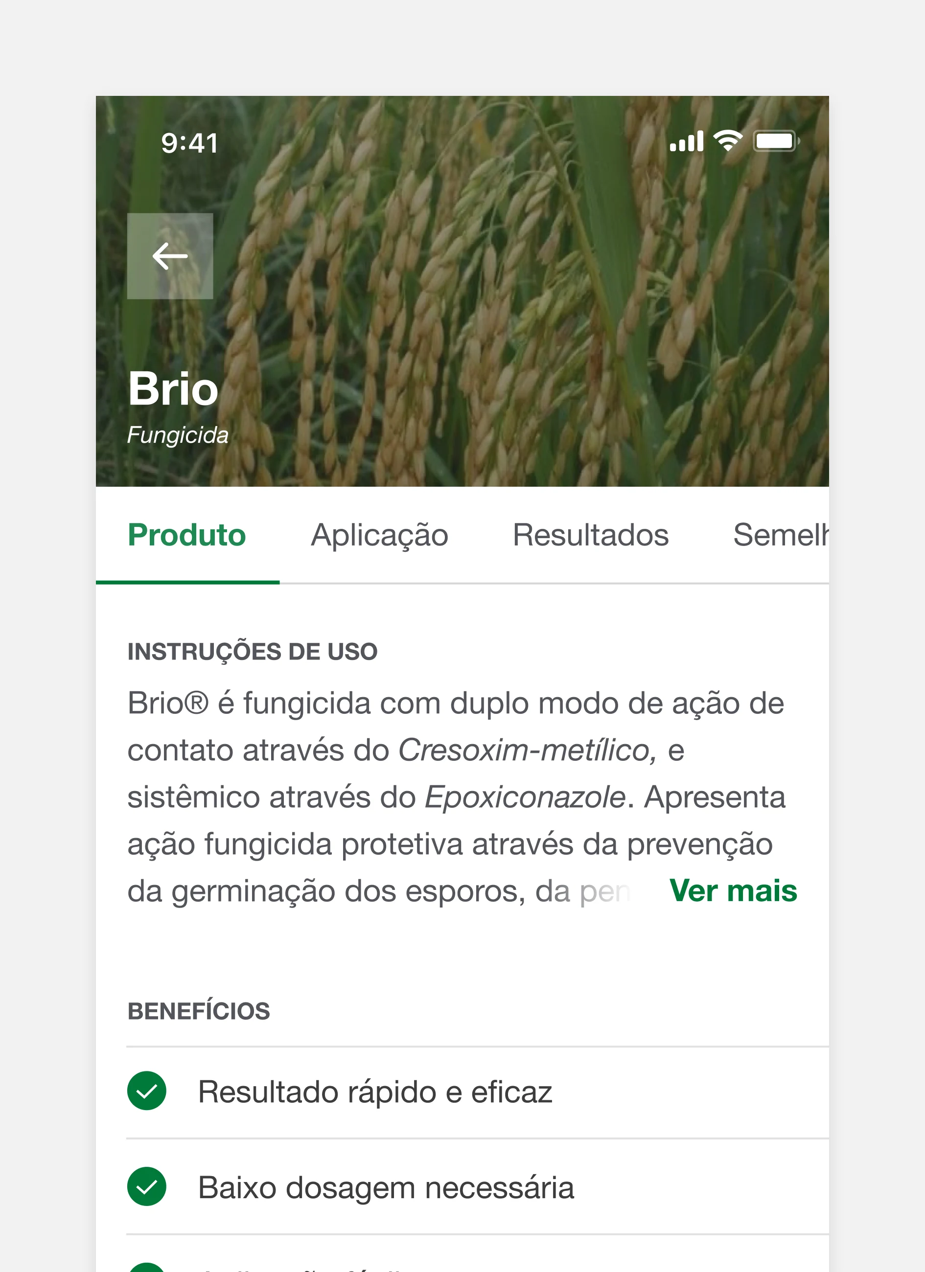
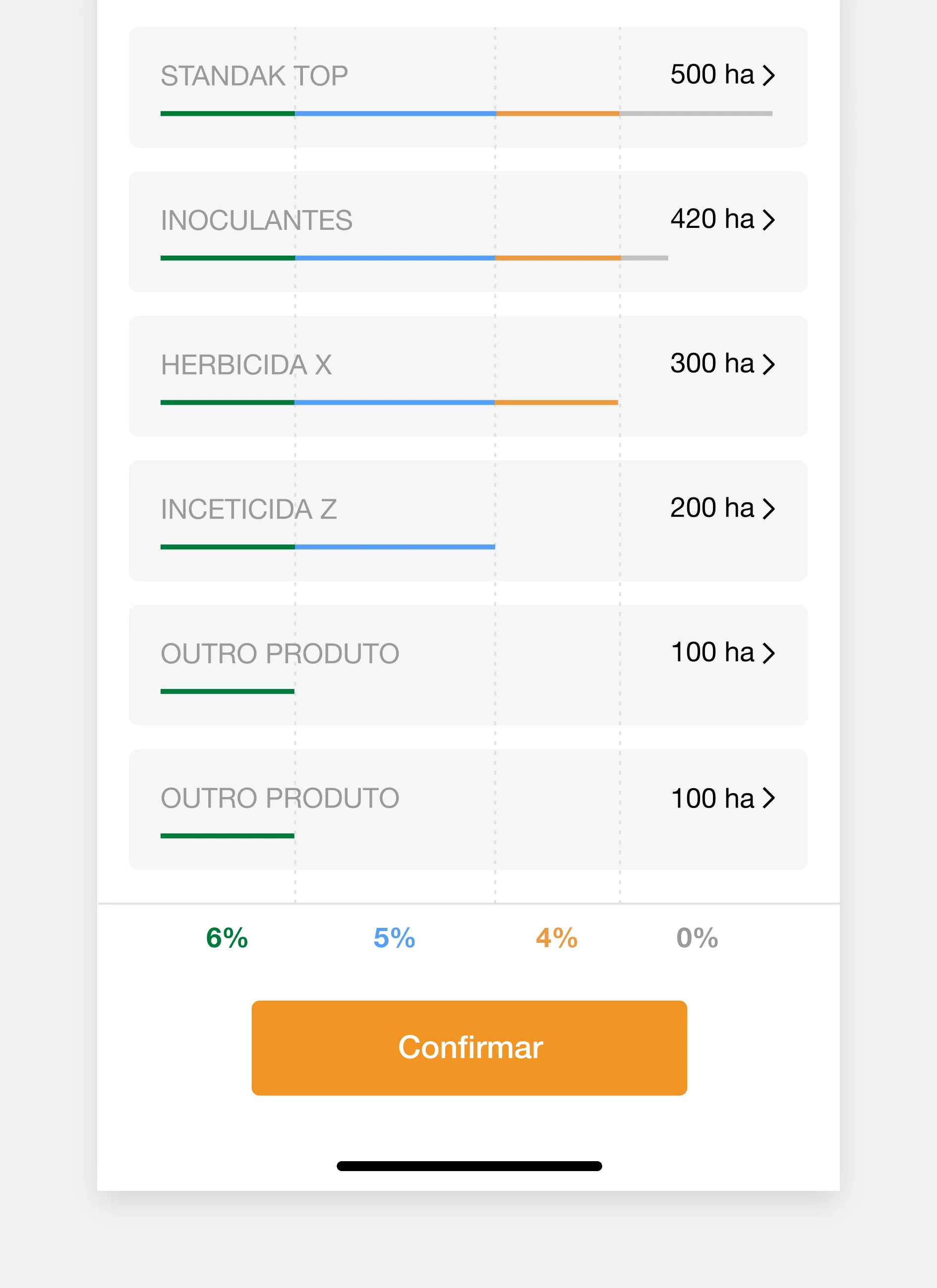
NEW FEATURES
Besides having finished the app's core features, our team did not want to stop there. So we went beyond, collecting user feedback, polishing the app, and designing new features, transforming the company's business even more through a digital solution.
ADMIN PORTAL
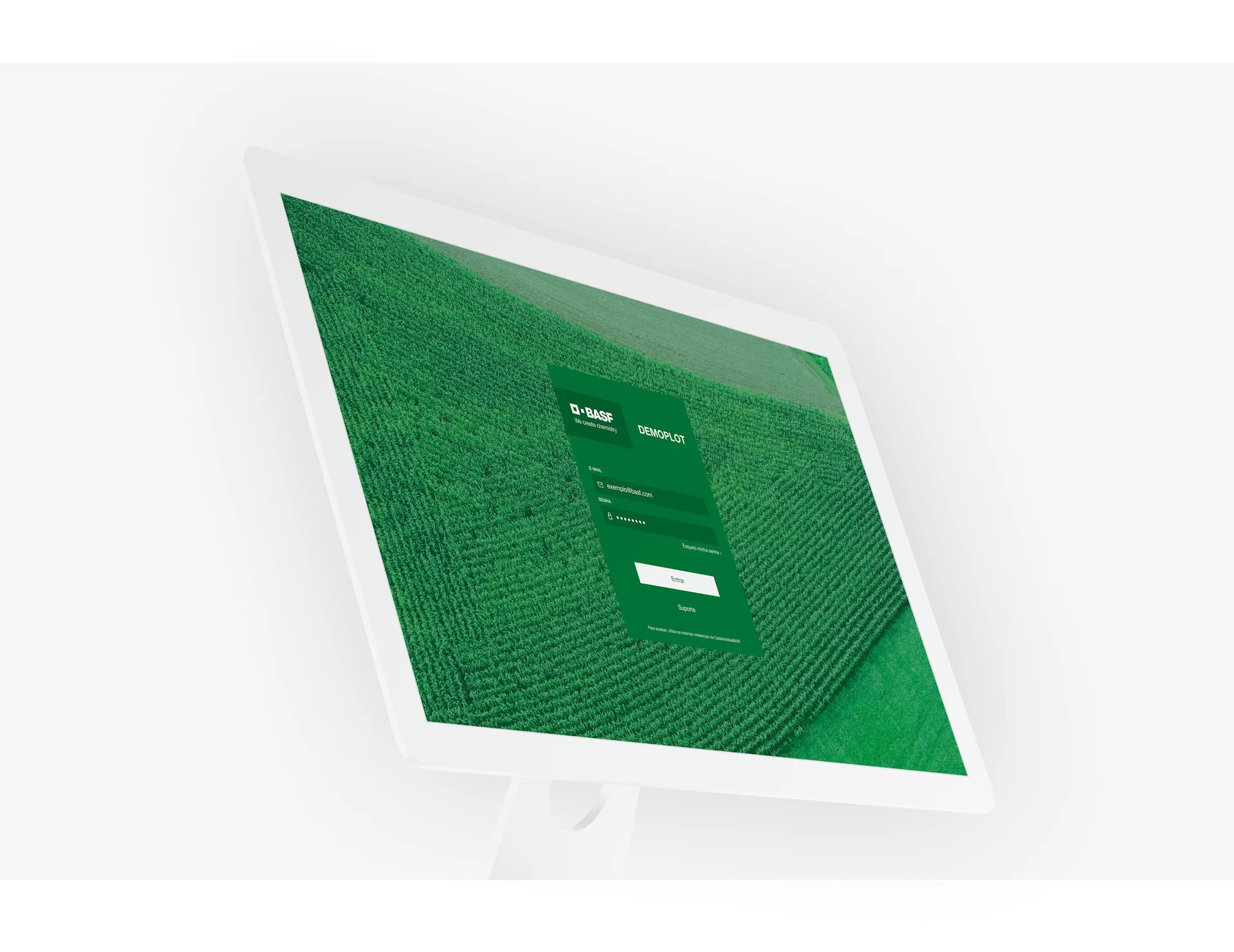
While the majority of the features of our product were designed to be used on the phone, the internal tools needed to make this happen needed to be more productive, and an admin portal was created to add and update new products, keep track of new orders and give support for the users.
Learnings
& Insights
TAKE IT TO THE FIELD —
While sometimes it's hard to travel a long distance to know a user's reality in person, or to submit prototypes to usability tests on the real field, the insights you can gather in these locations are singular and can not be achieved elsewhere. Discovering how a simple contrast ratio change makes text much more readable under the sun, or changing your button size because your users have really thick fingers after years working in the field were life-changing experiences.
SIMPLE BUSINESS, SIMPLE INTERFACE —
On such traditional and strict companies like BASF, it is common that most business rules are defined by people high in the hierarchy. Having no ability to change or simplify these rules for a determined feature surely proposes a hard challenge, but also proposes an opportunity to work around it, making thoughtful compromises to achieve the best user experience possible.
SIMPLE BUT EFFECTIVE —
The chemical industry is very regulated and has a lot of procedures and rules, many of which very related on how safely apply its products. While sometimes our eyes can directly look forward to create innovative solutions and mind-blowing processes to solve such problems, sometimes a simple, well done application can have a better impact, reaching same results with a much lower cost.